General Information
In this part of the styleguide we want to offer a basic guideline for the minimum requirements when it comes to using the editing the TYPO3 logo in its various forms.
The TYPO3 logo with word and figurative mark is used for official brand communication and design.
The TYPO3 Association hosts events such as TYPO3 Developer Days or T3Board. Apart from that, there are also several, community-hosted events such as camps. While being independent from the official distributions, recognition with the brand TYPO3 is desired. To distinguish the event logos from the official brand logo –variations of the official logo are allowed and desired. The figurative mark is an eye catcher and offers enough recognition with TYPO3. Therefore it is the minimum element which should be integrated into every event logo. Please also ensure that the event logo should convey a positive feeling.
The TYPO3 logo
The TYPO3 logo (symbol and word mark) should always be placed in the upper left corner of documents, flyers or websites. The minimum clear space surrounding the logo is 2 times x, where the value of x is derived from a third of the height of the letters of TYPO3. Whenever possible – leave more white space to let the logo breathe!
The TYPO3 logo with additional text
The additional text line (taglines; as shown in the example) should only be used to give additional information such as a name of a trade fair (with location) or TYPO3 internal events. The gridlines shown in the example indicate the area around the logo, which should be kept clear of competing text, images or other graphics.
Events & Subbrand Logos

The TYPO3 figurative mark
The figurative mark can be edited under following conditions:
- The silhouette must not be changed or altered
- Respect the protected space around the figurative mark
- Protected area of figurative mark is ¼ size of the its width
Font
The font “Share” is reserved for the brand logo and may not be used for the tagline. Apart from that, any font can be used for the word mark of the event logo.
Color
The figurative mark, when used in its original design, should only be used in following colors: orange, white and black with gradations. For the event word mark any color can be chosen.
Contrast
The figurative and word mark should have enough contrast (ratio at least 3:1) to the background, so that it meets the guidelines for accessibility.
To check the contrast you can use a contrast checker e.g.:
https://webaim.org/resources/contrastchecker/
Examples for independent event logos

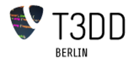
Former usage
✓ Figurative mark is orange
✘ Share font is used for word mark
✘ Protected space is not respected
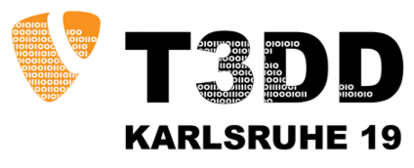
Suggestion for new usage (1)
✓ Protected space is respected
✓ Word mark isn't in Share font
Example with image or pattern used in the figurative mark. The figurative mark remains recognizable. The outline is preserved.
Suggestion for new usage (2)
✓ Protected space is respected
✓ Word mark isn't in Share font
Example with image or pattern used in the figurative mark. The figurative mark remains recognizable. The outline is preserved.
Do you have any questions?
If you run into any problems using this styleguide or would like to contribute additional presets or templates, please don't hesitate to contact the desing team via Slack or mail to designteam(at)typo3.org.